How to Paint Water with Watercolors Tutorial
Learn how to paint water with watercolors tutorial. Beginner friendly video lesson loaded with expert guidance for reflections, waves and more.


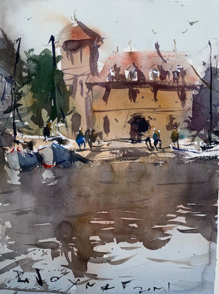
If you’re seeking guidance on painting reflections using watercolors, you’ll find this video demonstration and breakdown extremely helpful. Additionally, I’ve included an image of the finished artwork, an inspiring reference image, and a list of materials used.
Tips for Achieving Watercolor Reflections
The video tutorial above covers a variety of techniques, but here are my top tips to enhance your next masterpiece featuring reflections starting with materials.
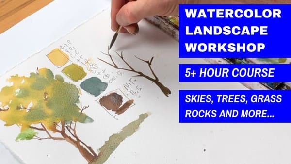
Suggested Material Checklist
Materials can make or break the outcome of a watercolor study. Watch the video that covers the best watercolor materials if you need more specifics about color choices, brush sizes and such. Basically, it’s exactly what I use and recommend for all levels.
Watercolor Paints: Opt for artist-grade watercolor paints in a range of colors. Choose a basic palette that includes six primary colors (one cool and warm hue for each one including red, blue, and yellow) along with earth tones for a versatile collection.
If you aren’t aware of the six primary palette, then check out our in-depth article on how to mix watercolors for beginners. It has the exact hues I use for every painting. And, if I make changes, I always update the article so you know the exact hues that get the best results.
Brushes: Invest in a set of good-quality watercolor brushes with different shapes and sizes. Round brushes are excellent for detailed work, while flat brushes are great for larger washes. I’d recommend one medium and one large pointed round. Then get a large mop brush that will handle those initial washed that are applied in the very beginning.
You only need three brushes to do most of the heavy lifting! However, I do recommend having a dagger and possibly and Motler on hand as well. Check out the article I wrote on how to choose the best watercolor brushes if you have questions on the exact brands, sizes and such.
Paper: I highly recommend selecting watercolor paper specifically designed for this medium. Look for papers labeled “cold-pressed” or “hot-pressed” to suit your preferred texture. Experiment with different weights and brands to find the one that suits your style. Most beginners choose 140 lb. cold press to start their journey. Hot press tends to be a little slick and most used for highly detailed work and portraits.
Avoid cheap, wood pulp papers as they don’t react properly to washes and other techniques. These cheaper papers tend to break down quickly and don’t age well either, basically yellowing over time. Be sure to read the how to choose the best watercolor paper article when you have time.
If you aren’t aware of the six primary palette, then check out our in-depth article on how to mix watercolors for beginners. It has the exact hues I use for every painting. And, if I make changes, I always update the article so you know the exact hues that get the best results.
Palette: A palette is essential for mixing and diluting your watercolors. Choose a palette with wells to hold different colors and a large mixing area. Small palettes tend to get dirty too quick and I found it difficult to have enough free space to mix enough colors without having to stop everything to clean up. The Masterson Pro palette works great and available at Amazon and Blick Art.
Water Containers: Have at least two containers for water—one for rinsing your brushes and another for clean water. Make sure the containers aren’t too small, and I would recommend plastic over glass. I’ve had plenty of studio accidents and cleaning up shattered glass isn’t ideal when in a creative mode.
Masking Tape and Drawing Board: Masking tape helps secure your paper to a drawing board, keeping it flat and preventing it from warping. The tape is optional and depends if you prefer the clean edges. In the beginning you will most likely focus on sketches and studies, so maybe pass until you determine later on if you need it.
A smooth, firm board is a must! I recommend Gator foam board as it’s very sturdy, smooth and durable. Fairly inexpensive and light weight to boot. That covers materials, let’s move on to skills you need to start watercolor painting.
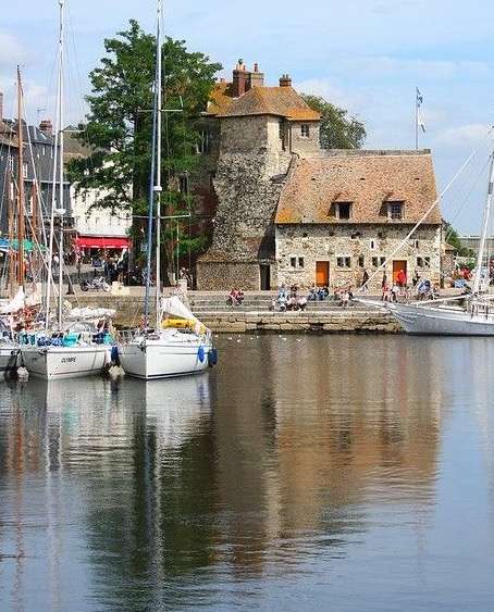
Find a suitable reference image
Ensure that the subject you’re painting excites you! The image I’m using motivated me to pick up my brush and start painting. However, before you begin applying paint, plan out the values, point of interest, and color choices. You can search for great reflection photos on Google.
Are you a beginner? If so, be sure to check out our beginner’s guide to learning watercolors.
Focus on design and composition
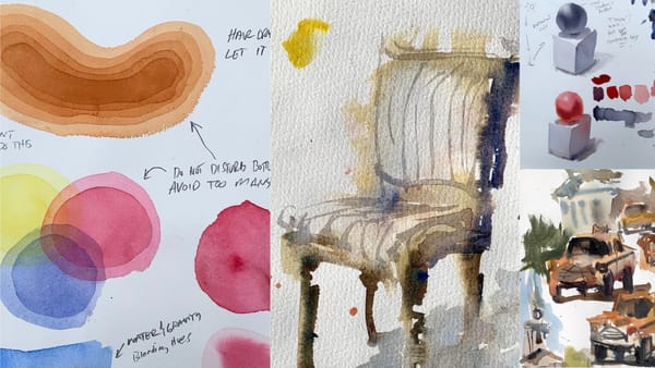
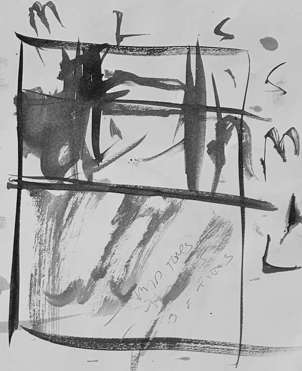
Personally, I prefer using the small, medium, and large rule of thirds, as opposed to the traditional grid dividing the area into nine equal parts. In the quick study I completed above (which took about one minute), you can observe the three different-sized grids represented by ‘S’, ‘M’, and ‘L’ (indicating small, medium, and large). This article on designing captivating watercolor landscapes is a great resource.
Strive to allocate a large area for both the horizontal and vertical spaces. In this case, I deliberately positioned the large areas towards the bottom to capture the reflections. Additionally, the large space is centered horizontally due to the presence of the building. I aimed to manipulate elements vertically and horizontally to enhance visual harmony.
Want more watercolor landscape painting ideas?
Establish a value hierarchy
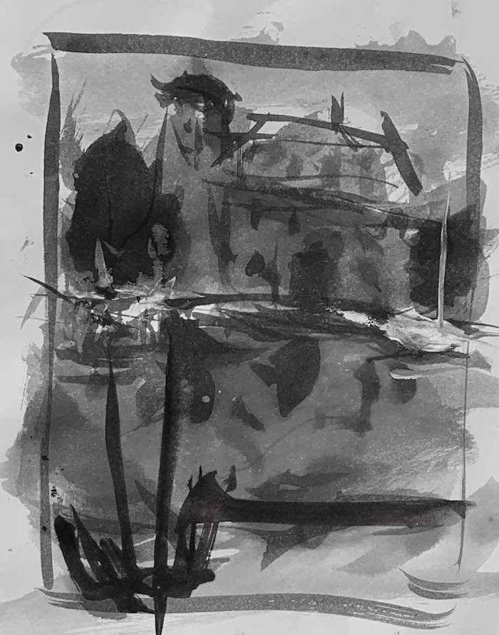
I seldom begin a painting without fully comprehending the placement of values. This involves adjusting values until the scene is simplified and connected within the value structure. The image above is another quick sketch I did on scrap drawing paper, demonstrating how the values will be organized.
Achieve color harmony
I prefer to simplify this aspect as well. Choose between chromatic or tonal harmony. You can learn more about this in the linked article. The finished artwork represents a tonal palette, with gray and less saturated color choices. Personally, I rarely replicate colors exactly as seen in photos, as I find it challenging and overly restrictive.
Conclusion
I hope you found these tutorial tips useful. Painting water reflections demands patience and practice. I’m confident you’ll excel if you develop a system that works for you and paint diligently. Best of luck, and feel free to leave a comment below if you have any questions.