Urban Landscape Watercolor Video Demo Lesson
Discover an amazing landscape watercolor video demo lesson loaded with fresh ideas and useful tips for all levels. Break away from tight art!
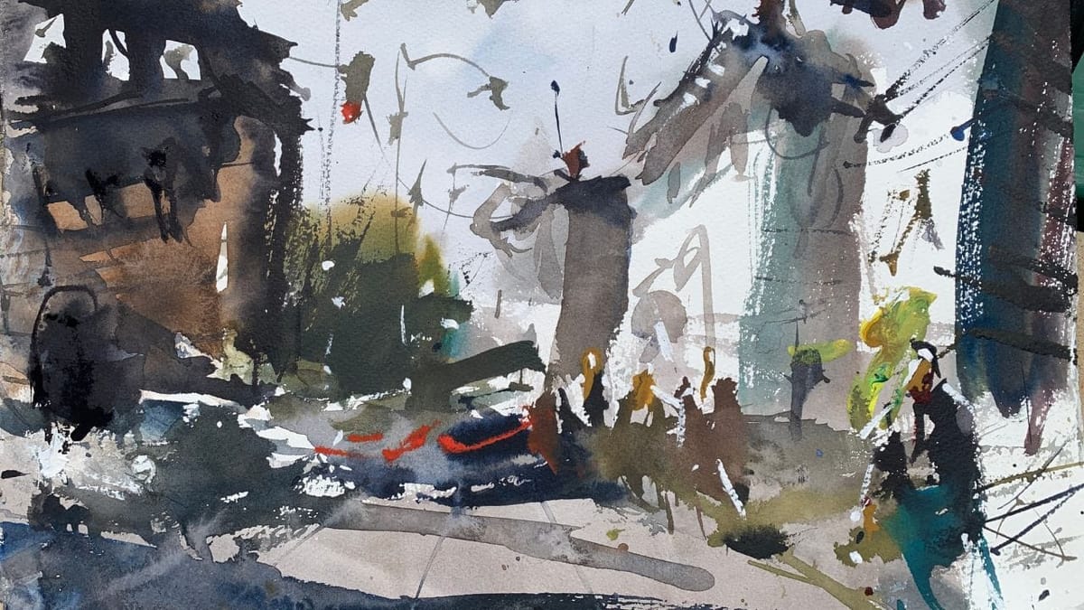
Few subjects are more inspiring than urban landscapes, perhaps a work boat, or two, but cityscapes are pretty awesome. In this video demo we will explore the captivating world of urban landscape watercolor painting. I hope the information shared here will help fire you up and paint an amazing masterpiece full of cars, people and buildings.
Whether you’re a watercolor beginner seeking inspiration or a seasoned artist looking to expand your skills, this breakdown will provide valuable insights.
Video demo
Let’s get started painting a loose urban landscape with watercolors
Take a moment to watch the video demo below, where I’ll guide you through the creation of this urban landscape painting from its initial stages. While it may not be a traditional teaching video, observing the techniques employed will provide valuable insights into painting processes such as working from light to dark and establishing a strong value hierarchy.
After watching the video, continue scrolling down for additional tips and guidance on how to approach painting urban scenery. Not mentioned in this post is using quality watercolor supplies. I’ve written an article that covers my favorite watercolor supplies I use and recommend in case you are curious.
Composition: A Crucial Foundation
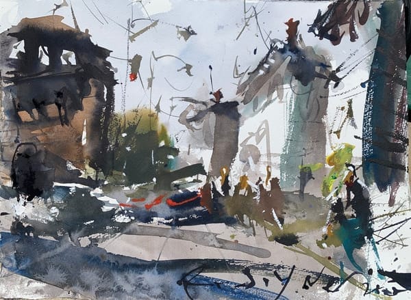
At the heart of any successful artwork lies a well-thought-out composition, and this urban landscape watercolor is no exception. The artist skillfully employs a ‘U’ shape composition, anchoring the lower left and right corners with a figure and car, which seamlessly connect to a shadow on the left side.
This deliberate arrangement ensures that viewers can enter the painting from either side, allowing their eyes to traverse the middle-ground and return to the opposite side. The presence of the shadow subtly directs their gaze, guiding them on a visual journey throughout the piece.
Value Hierarchy: Guiding the Viewer’s Eye
Creating a captivating watercolor landscape involves strategically managing values. In this artwork, the artist employs a value hierarchy to great effect. Heavy darks are concentrated on the left-hand side, attracting viewers’ attention to that area. The mid-tones and values are skillfully positioned in the background, suggesting the tops of cars using negative space techniques.
On the other hand, lighter values dominate the right-hand side of the scene, providing balance and enhancing visual interest. The deliberate manipulation of values guides the viewer’s eye and adds depth to the composition.
Color Harmony: Striking a Tonal Balance
When it comes to color, a well-balanced and harmonious palette is key. In this urban landscape watercolor, the artist opts for a tonal approach, desaturating and graying down the majority of hues. This restrained use of color creates a unified and cohesive atmosphere throughout the artwork.
Although there are a few vibrant notes strategically placed to enliven the painting, the overall tonal palette prevails, adding a touch of liveliness without overpowering the scene.
Looking for some fantastic watercolor painting ideas?
Asymmetry: Embracing Visual Interest
In this artwork, asymmetry takes center stage. The intentional avoidance of perfect symmetry adds visual intrigue and keeps the composition dynamic. While achieving a harmonious balance between elements can be challenging, the artist skillfully crafts a scene that captivates the viewer’s eye. The avoidance of symmetry, despite decades of experience, showcases the artist’s continuous commitment to mindful design and execution.
Appreciating the Finished Artwork
When observing the final artwork, one cannot help but admire its expressive and loose style. However, closer examination reveals the meticulous craftsmanship underlying its creation. It’s a testament to the shared dedication to planning and thoughtful execution exhibited by both realistic and loose painters. To further fuel your artistic inspiration, we invite you to explore another captivating landscape painting tutorial. Feel free to share your thoughts, questions, and comments below.
Join us on this artistic journey as we unravel the mysteries of urban landscape watercolor painting. Discover the magic that lies within seemingly effortless brushstrokes and gain a deeper understanding of the intentional choices that shape a visually captivating artwork. Let your imagination roam freely as we explore the intricate details of this urban landscape watercolor demo.
Suggested Material Checklist
Materials can make or break the outcome of a watercolor study. Watch the video that covers the best watercolor materials if you need more specifics about color choices, brush sizes and such. Basically, it’s exactly what I use and recommend for all levels.
Watercolor Paints: Opt for artist-grade watercolor paints in a range of colors. Choose a basic palette that includes six primary colors (one cool and warm hue for each one including red, blue, and yellow) along with earth tones for a versatile collection.
If you aren’t aware of the six primary palette, then check out our in-depth article on how to mix watercolors for beginners. It has the exact hues I use for every painting. And, if I make changes, I always update the article so you know the exact hues that get the best results.
Brushes: Invest in a set of good-quality watercolor brushes with different shapes and sizes. Round brushes are excellent for detailed work, while flat brushes are great for larger washes. I’d recommend one medium and one large pointed round. Then get a large mop brush that will handle those initial washed that are applied in the very beginning.
You only need three brushes to do most of the heavy lifting! However, I do recommend having a dagger and possibly and Motler on hand as well. Check out the article I wrote on how to choose the best watercolor brushes if you have questions on the exact brands, sizes and such.
Paper: I highly recommend selecting watercolor paper specifically designed for this medium. Look for papers labeled “cold-pressed” or “hot-pressed” to suit your preferred texture. Experiment with different weights and brands to find the one that suits your style. Most beginners choose 140 lb. cold press to start their journey. Hot press tends to be a little slick and most used for highly detailed work and portraits.
Avoid cheap, wood pulp papers as they don’t react properly to washes and other techniques. These cheaper papers tend to break down quickly and don’t age well either, basically yellowing over time. Be sure to read the how to choose the best watercolor paper article when you have time.
If you aren’t aware of the six primary palette, then check out our in-depth article on how to mix watercolors for beginners. It has the exact hues I use for every painting. And, if I make changes, I always update the article so you know the exact hues that get the best results.
Palette: A palette is essential for mixing and diluting your watercolors. Choose a palette with wells to hold different colors and a large mixing area. Small palettes tend to get dirty too quick and I found it difficult to have enough free space to mix enough colors without having to stop everything to clean up. The Masterson Pro palette works great and available at Amazon and Blick Art.
Water Containers: Have at least two containers for water—one for rinsing your brushes and another for clean water. Make sure the containers aren’t too small, and I would recommend plastic over glass. I’ve had plenty of studio accidents and cleaning up shattered glass isn’t ideal when in a creative mode.
Masking Tape and Drawing Board: Masking tape helps secure your paper to a drawing board, keeping it flat and preventing it from warping. The tape is optional and depends if you prefer the clean edges. In the beginning you will most likely focus on sketches and studies, so maybe pass until you determine later on if you need it.
A smooth, firm board is a must! I recommend Gator foam board as it’s very sturdy, smooth and durable. Fairly inexpensive and light weight to boot. That covers materials, let’s move on to skills you need to start watercolor painting.
Conclusion
The urban landscape watercolor video demo we’ve explored in this blog post demonstrates the fascinating interplay of composition, value hierarchy, color harmony, and asymmetry in creating a captivating artwork.
If you want to explore and learn more about watercolor painting techniques?
As you embark on your own artistic journey, remember that the beauty of watercolor lies not only in its expressive qualities but also in the careful planning and execution behind each stroke. By studying and understanding the techniques employed in this artwork, you can enhance your skills and approach to urban landscape painting.
We invite you to continue exploring our blog for more inspiring tutorials and insights that will elevate your artistic practice. Feel free to share your thoughts, questions, and experiences as we journey together into the world of urban landscape watercolor painting.
